There was a time, when I was in sales for a high-end commercial scanning service, that I wore suits for most of my sales calls and production meetings. I got into the business fashion thing, it being New York, and found I liked the feel of fine fabrics. Clients remarked on my collection of colorful ties. I even had a vest or two.
It was a thing.
Somehow I got wind of a Hong Kong tailor who offered made-to-measure custom suits for a fraction of the cost that I would pay at Brooks Brothers or Paul Stuart. He traveled key cities, saw customers in his hotel room, and a few weeks later your custom suits arrived.
It was awesome. Rich fabric. Perfect length. Super fit. A hidden pocket for my magnifier and proofing pen. A sense of ownership that I’d never felt with off-the-rack.
Software is the same way.
For years, graphic artists and photographers have been able to customize the layouts of their software to suit their workflows. Adobe Photoshop and Lightroom Classic let you reconfigure tools, control window positions and add labels to suit your style; as does Capture One, Final Cut Pro, and others. You have some ownership in the experience.
Unlike consumer level software.
Every year people fuss about the feature and minor navigation changes in Apple Photos, but the truth is it hasn’t changed that much since 2002 when it was introduced. On the Mac you’ve had a left-hand sidebar with section links next to a working space that is either the Library grid or a feature/task detail. On mobile you have had some manner of sub-windows across the top or bottom to drill down to those same tasks.
It’s simple and orderly and has influenced almost all photo management software for years.
Mostly, photos have been organized in a linear way with nods to your calendar. Which is fine for organizing, but not so much for accessing them. More and more our collections number tens of thousands of photos over decades. Exact dates become fuzzy. Photos need a larger context to be findable; which is where location, events, people, and caption details become essential.
In the end, what we really want is to find photos the way we actually think about them, and with the emergence of artificial intelligence - or Apple Intelligence as Apple calls it - Apple is now setting us up to do that.
The new Apple Photos layout takes a big step toward organic photo management by de-emphasizing the calendar and showcasing context. Once imported to Photos, image search is as much about the What as the When. Not that all the old rules are thrown out, they’re just presented in a new way.
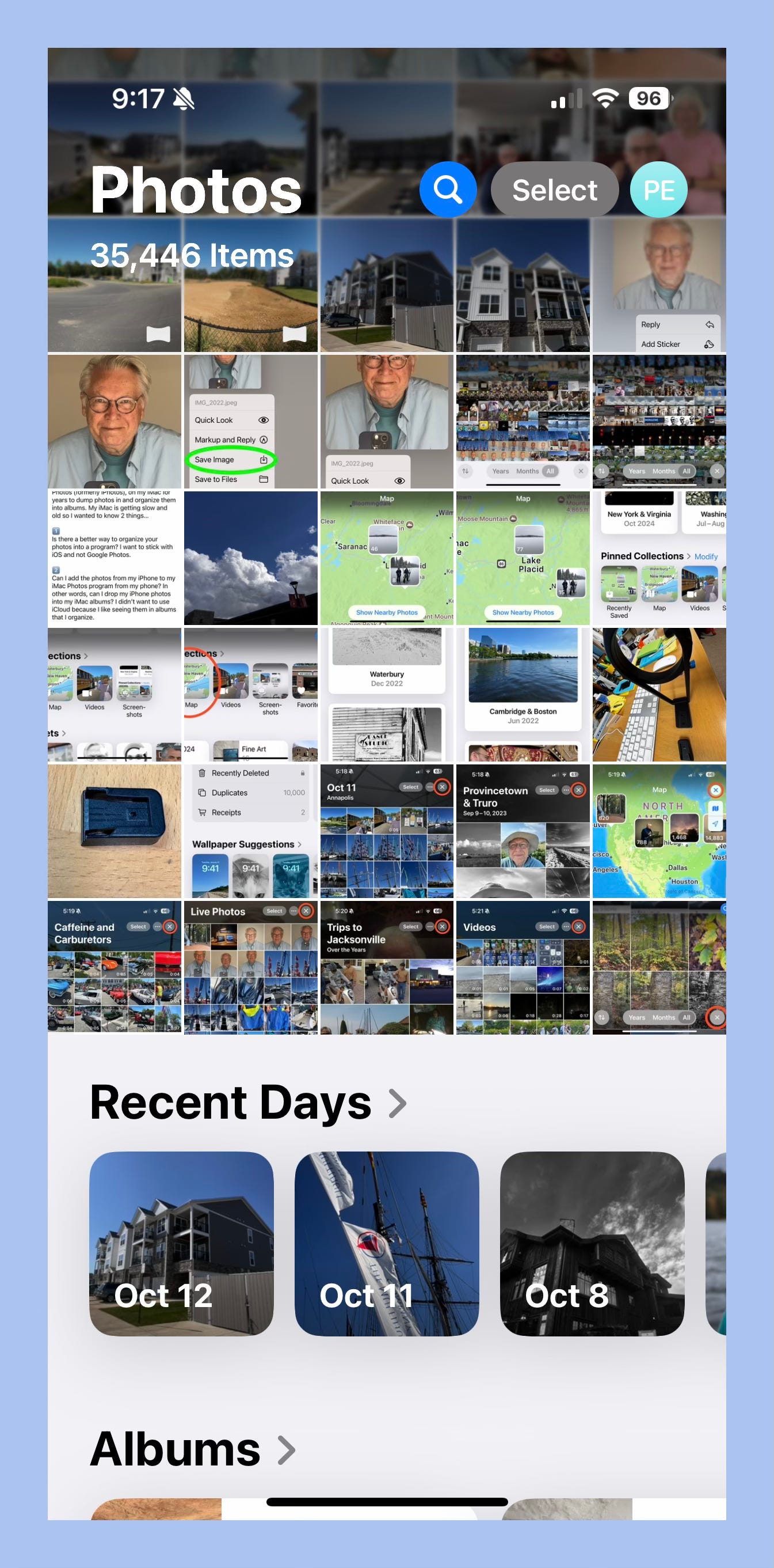
Instead of burying Days in the calendar where it was tedious to find, Apple Photos merges the concept of Days with Recents and offers up a new collection called - wait for it - Recent Days. Perfect for sharing something that just happened “the other day” and it is front and center so you don’t have to hunt for the category before you hunt for the photo.
Another nod to lifestyle is the Trips collection. Apple intelligence is at work to group photos that it sees as away from “home.” This saves a lot of time pinning down travel moments that can be enjoyed as is or used as the foundation for curated Albums.
Other doses of reality are new collections like Illustrations, Handwriting, Receipts, Documents, and QR Codes. Images that have little to do with date and time in the first place.
So what’s all this got to do with made-to-measure suits, you ask.
How about made-to-measure photo management?
On top of the smarter collections model, Apple Photos takes it one step further by letting you customize the software layout just like the pros do. You get to reorder and even hide collections that aren’t relevant to you.
Let’s see how that works.
When you launch into Apple Photos you get a screen that’s the last 30 photos in your Library and the first couple of collections on the home page. By default you’ll see Collections for:
Recent Days
Albums
As you scroll down, you’ll see more collections for:
People & Pets
Pinned Collections
Memories
Trips
Featured Photos
Media Types
Utilities
Shared Albums
Wallpaper Suggestions
And at the very bottom of the page you’ll see Customize & Reorder. This is where you get to create your made to measure photo management layout in 3 easy steps.
Touch and drag the 3 lines to the right of each section to move them up or down and create a new order.
Uncheck Collections you don’t ever use or want to see.
Tap Reset to switch the layout back to the Apple default
Let’s say you’re a traveller, and vacation photos are what you like to share. You can move Trips to the top of the list to see that Collection when you open the Home Screen.
Or your thing is the people in your life and you’re always sharing and reviewing those moments. You could move that up the list as well and have the latest pictures of your grandchildren right at your fingertips.
The photos you want without browsing through your camera roll.
But it gets even better with the Pinned Collections. This is essentially a collection of collections where you can mix and match People, Albums, Recent Days, Memories, and whatever else into one custom collection. So your Pinned Collection might include 2 of your favorite people, 3 of your favorite albums, a memory video of your pets, and that trip you took to Europe for your anniversary. You could move this to the top, so this Pinned Collection shows up right under your photo gallery when you launch photos. No more scrolling around to find “that” photo.
Now you have your own personal made-to-measure photo management layout in Apple Photos.


Thank you, Paul!